Sidi Mohal · Caledon, Ontario
About Me
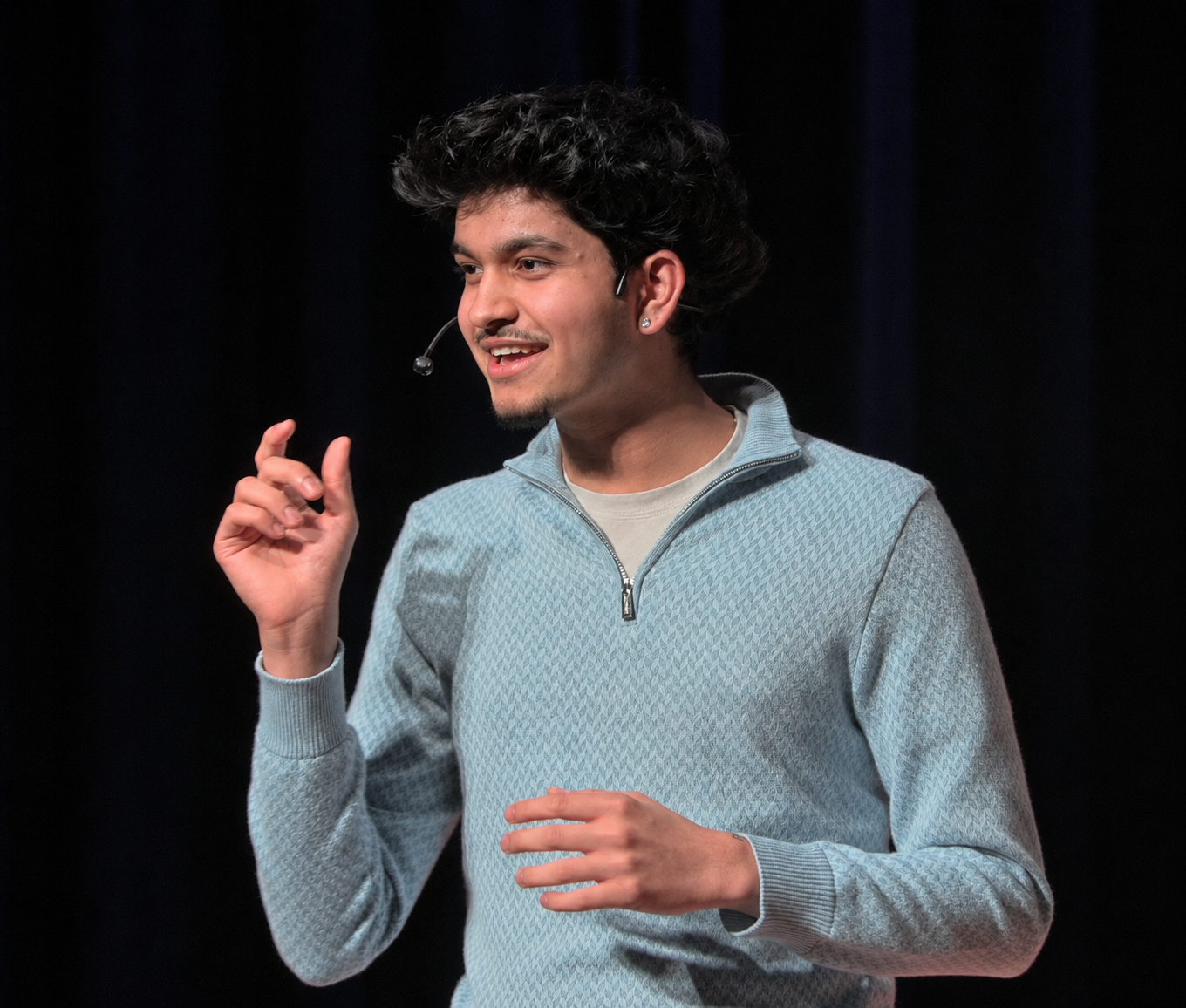
Hi, I'm Sidi
16 | TEDx Speaker | Yale Young Global Scholar | National Advisory Council @ FBL Canada | Camp Rising Sun (1 of 60 of 3,000+)
I'm the kind of person who likes building things and putting them in front of real people. I gave a TEDx talk on how algorithms shape our generation, I'm a Yale Young Global Scholar, and I sit on the National Advisory Council for FBL Canada, the country's largest student business organization. This summer I'll also be a Canadian Ambassador at Camp Rising Sun, chosen as 1 of 60 people from over 3,000 applicants across 100+ countries.
Design ties into everything I do. I used the skills from this class to design slide decks for FBL Canada and to code this entire portfolio from scratch. I came into TGJ2O having only messed around with design for my own projects, and I'm leaving able to use professional tools properly and on purpose.
Beyond this class
Hobbies & interests
Before this course
This was my first real design course. Before it I taught myself bits of design for my own projects and clubs, and I self-studied AP Human Geography (scored 5) and AP Psychology (scored 4) back in grade 9. This class was where I finally learned to do it properly.